We needed insight into Care Coordinators' (CCs) work practices and what behaviors negatively impacted the number of patient calls per day.
We also experienced a disturbing trend wherein a sizable percentage of newly hired CC's would leave within their first 2 months. This turnover rate
was frustrating, expensive, and risked compromising patient care.
I worked with HR, QA, and recruiting teams on 2 initiatives that identified best work practices and improved the new hire experience. I conducted interviews, observed CC's working, and consolidated the data into models that illuminated the breakdowns. From these we were able to triangulate upon solutions.
Introduced persona-based hiring. Reduced inefficiencies in hiring practice. Increased retention rate.
Identified most efficient task planning and workspace set up for CC's.
TimeDoc Health | Care Director Plan | Care Director | Experience Transformation
Qualitative Data Collection
Participants shared their level of confidence after training and what portions of training felt most relevant once they were on the job.
It was often revealed that employees from different departments worked at cross purposes. In addition, most interviewees (regardless of performance level) felt that Quality Assurance monitoring and grading felt unreasonable and deliberately punitive.
Specific users often developed ad-hoc practices to make their work more accurate and efficient without breaching security protocols. This knowledge, however, was not widely disseminated leading to overall inconsistencies.
User Observation
Cataloged the day to day practices of 5 high performing and 5 low performing Care Coordinators to isolate behaviors that could be consistently replicated across the team.
Identified personal history and previous employment trends of those people with the greatest longevity and highest performance rates.
data consolidation
User comments were categorized into themes using an affinity diagram
Stages of the overall process were isolated as swim lanes. Steps each role took in the overall process were organized into these swim lanes with breakdowns identified.
Lots of data
We saw that the employees with the most advanced training and experience were less likely to be high performers.
E.g. bilingual care coordinators don't have as many patient calls per day. But the service they provided to the non-English-speaking patient population was far more in-depth & vital in those patients' lives.
Care Coordinators spend their day calling patient after patient regarding emergent health concerns, verifying that the patient understood their last PCP visit, and scheduling appointments for overdue screenings & vaccinations among MANY other things. For this reason they need to have several browser windows and programs open on their monitor at all times: TimeDoc software, the automatic dialing program, the patient's EMR, the preferences for that patients primary care physician, as well as their company email and chat. Additionally they could have several desktop stickies visible.
When watching recordings of high and low performers I could tell within the first few seconds, without knowing who I was watching, whether I was looking at a high or low performer simply because of how their desktop was organized. Two major factors differentiated high performers. First, all the many programs and windows were arranged by importance left-to-right across their monitors. Second, they minimized desktop noise by having only those items necessary for making a call open and having a simple desktop background.
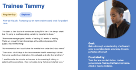
Identify Personas
Qualitative testing data built a persona library based upon users' real qualities and attitudes. Since the job entailed talking to patients on the phone all day, character and attitude were a better litmus for success than advanced license qualifications.
I associated personas with each user that we had ever interviewed or who participated in users testing. This helped build an understanding of which personas would be the most successful at the company and influenced what hiring managers listened for when interviewing potential employees.
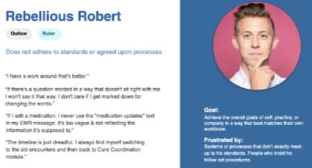
Because we dealt with sensitive patient information, it was necessary to represent those employees whose attitudes and qualities posed a risk. From the user data I isolated personas whose potential misuse of our software and security protocols could lead to negative consequences for the company.
This provided hiring managers with a guide to things they should listen for when interviewing potential candidates.
Short Term
Setting up ones desktop windows seems at first like a very personal thing and something too trivial to be incorporated within employee training. But user observations proved that no aspect of work should be overlooked.
Employees were retrained on how to set up their work space (browsers/windows open on monitors) to maximize efficiency. We instructed them on having consistent, specific zones of work, minimizing monitor clutter, and ordering their online tools in a left-to-right, top-to-bottom format prioritizing placement by importance.
Employees were also instructed to remove busy patterns and images from desktop backgrounds.
Scheduled knowledge sharing sessions so that higher performing employees could share skills and practices.
Long term
The training period for new Care Coordinators had been significantly shortened in recent years to get CC's working and making calls earlier. However, this left many new hires with a lack of confidence. Early mistakes resulted in negative ratings from Quality Assurance, further eroding morale. It was decided that new hires needed to shadow experienced care coordinators for a longer period of time before working independently.
In addition, team leaders were given Full Story access so they could observe the work practices of their direct report CC's. Team leads monitored and gave guidance in a manner that felt less punitive.
With Full Story access team leaders were also able to inspect incidents that caused direct reports to receive negative marks from QA. In several cases they identified that errors had occurred within the software and remove negative citations for the care coordinator.
Using the developed personas and anti-personas, hiring managers were equipped with what qualities to prioritize when interviewing candidates.
Original feature
Little of the functionality was used. White buttons below patient name are unituitive and require "hover and discover" to reveal their function (which does not match the icon...at all). Much of the data shown is not used at all.
First redesign
Initial redesign adhering to UK National Health System regulations. Functionality of incons moved to drop menu. A cleaner design to the top portion with 5 expandable sections beneath to show more detail. Given the diverse nature of our user base, the sections of the banner are customizable to display what a particular client would need.
Test results
Expanding and collapsing controls proved to be problematic. In addition users requested that certain features not be moved into the "quicklinks" drop down.
Redesign
Expand/collapse changed to a drawer control. Favorites icon moved back to next to patient name.
Feature Release
Content cleaned up, buttons remain.
Better banner released.